Simplifying mobile banking for users of all ages and technical abilities, making financial services easy for everyone

Location:
Bangalore, IN
"Struggling with existing banking apps and seeing my family face the same frustrations made me realize how outdated many of these designs still are. Clunky navigation, poor accessibility, and a lack of personalization make even simple tasks harder than they should be."
~ Me
My Role
UX Designer
Platforms
Mobile App
Scope of Work
UX Design
Timeline
March 24' (4 weeks)
The Problem
Many banking apps still rely on outdated designs, making navigation confusing, accessibility limited, and personalization nearly nonexistent. Users, especially those who are not tech-savvy or have disabilities, struggle with complex interfaces, unclear information hierarchy, and a lack of user-friendly features. This leads to frustration, errors, and inefficiency in managing finances.
The Solution
A mobile banking app with an intuitive layout, personalized dashboards and simplified navigation making banking easier for everyone.

The Process
To gain insights into user frustrations and expectations, I analyzed app reviews from competing mobile banking apps. Common complaints included unclear information hierarchy, complex language, cluttered navigation, poor customer support and a lack of personalized features.

Research Insights:
01. “Unable to find what I’m looking for”
02. “Always face technical issues with login"
03. “Navigating to previous screen causes app to crash”
To understand what works well and what doesn’t in existing banking apps, I analyzed competitors, looking at their strengths, weaknesses, and user feedback. This helped identify gaps in usability, accessibility, and features, giving me a clearer direction on how to improve the overall experience.

To better understand user needs, I conducted a survey with a convenience sample of 34 people. The goal was to identify common pain points in existing mobile banking apps and the features users rely on the most.
So what were the survey findings?


We conducted multiple stakeholder interviews with the CEO and CTO which provided valuable insights into the constraints EVALV faces, helping us define the scope of the website and align its messaging with the business’s goals.
Interview Goals:
01. Identify banking needs based on professions and routines
02. Detect usability issues in tasks like transfers and navigation
03. Assess their comfort with digital banking, considering varying tech adoption
04. Discover desired features for better financial management
Interviewees:

Interviewee 1 - 61yo Business Owner

Interviewee 2 - 59yo Doctor
Interviewee 3 - 49yo Homemaker
Interviewee 4 - 21yo Student
Interview Insights:
01. Values quick and secure access to account details and real-time balance updates
02. Finds complex navigation and small, cluttered interface elements frustrating, hindering their ability to complete transactions smoothly
03. Desires simple and accessible authentication methods
04. Trying to login with a banking user name and password is sometimes a hassle
05. Prefers a customizable dashboard that puts their most important features front and centre


Michael:

Dr Elizabeth:

Emily:

Alex:

Common Goals:
01. Quick and secure access to account details
02. Simple and accessible authentication methods
03. Easy to navigate and perform common banking tasks without unnecessary complexity
04. Customizable dashboard that puts the user’s most important features front and centre
Common Painpoints:
01. Complex navigation
02. Complex language
After identifying common pain points and goals, I looked at where the banking experience needed improvement. Using the "How might we?" approach, I reframed these challenges into opportunities for design, leading to practical solutions that directly addressed user needs.
How might we?
01. How might we optimize app navigation to ensure users can effortlessly find and access features?
02. How might we improve the organization and structure of information within our banking app to enhance user understanding and accessibility?
03. How might we streamline the login process of our banking app for quick and secure access, prioritizing user convenience without compromising on security measures?
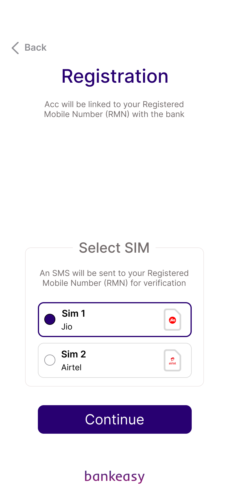
The Design
.png)

The Outcome
So what did I learn?
01. Quick Decision Making
Completing the entire process in a short period required balancing speed with thoughtful design choices. I learned to work efficiently without compromising quality.
02. Every Decision Needs to Serve the User
Given the time constraints, every element included had to have a purpose - no unnecessary complexity, just a focus on solving real user pain points effectively.
03. Visual Hierarchy Impacts Usability
The way information is organized and displayed can significantly affect how users interact with an app, emphasizing the need for clear, intentional layouts.
04. Iterating on the Fly
With little time for multiple design cycles, I adapted feedback from users quickly, refining ideas as I worked rather than waiting for a dedicated iteration phase.
05. The Power of Simplicity
Simplifying complex processes, like navigating a banking app, enhances usability and reduces user frustration, leading to a more satisfying experience.
06. Design Is Never Truly 'Finished'
The process highlighted that design is iterative. Even after delivering the final screens, there’s always room for improvement