SwarajAbility: India's first AI-powered job portal for persons with disabilities

Client:
Youth 4 Jobs Foundation
Location:
Hyderabad, IN
"India has over 60-70 million persons with disabilities (PwDs), but the employment statistics are grim—70% are unemployed or underemployed, and less than 0.5% are employed with top companies. Existing solutions like job fairs or conventional job portals don’t address the unique needs of PwDs comprehensively."
~ Jyothi Bezawada (Team Lead, Y4J Foundation)
Project Start Date: March 22'
My Role
UX Design Intern
Platforms
Web Application
Scope of Work
UX Design
Timeline
Sept 23' - Jan 24' (5 Months)
Team
Vinni Karn
(UX Lead)
Kunal Tainwala
(Senior UXD)
Disclaimer: Some specific information, logos, or content related to the project have been excluded from this portfolio due to copyright and confidentiality agreements. While I am unable to display proprietary or sensitive materials, I am happy to discuss my role, contributions, and the design process in more detail during an interview or in a confidential setting. Thank you for your understanding.
The Problem
In today’s digital age, job portals are key for job seekers, but most aren’t designed with accessibility in mind, creating barriers for persons with disabilities (PwDs). They often overlook the diverse needs of PwDs, making it hard or even impossible for many to use. Current platforms fail to address these challenges or scale to support the wide range of 21 disabilities in India, leaving countless people without access to meaningful job opportunities.
The Solution
The solution is a web application that connects persons with disabilities (PwDs) to job opportunities. Features are tested by PwDs to ensure they meet real needs, and it follows WCAG 2.1 accessibility standards. It offers easy registration, a simple application process, a Virtual Mentor, and AI-driven job recommendations tailored to each user.
My Role
To design purposeful experiences for the users of the web application, I focused on understanding who they were, their pain points, and their goals. I took the initiative to actively engage in team meetings with the client, ask clarifying questions, and dive into available user feedback and research to ensure the platform would best support their needs.
So who would be using the platform?
01. PwDs seeking employment
02. Employers seeking to employ PwDs
03. NGOs
04. Government Organizations
I researched online to deepen my understanding of accessibility standards and best practices. I also discussed with senior designers in the team to learn about practical applications and challenges in creating accessible experiences. Through this, I gained insights into the following key concepts.
So what did I learn?
01. WCAG 2.1 Guidelines
Understanding the core principles of WCAG - Perceivable, Operable, Understandable, and Robust (POUR) and learning to implement them.
02. Assistive Technologies
Gaining familiarity with tools like screen readers (e.g., VoiceOver, NVDA, JAWS), voice recognition software, and alternative input devices.
03. Color Contrast and Visual Accessibility
Recognizing the importance of high contrast and readable fonts for users with visual impairments, and understanding tools to test color contrast and text legibility.
04. Keyboard Navigation
Understanding how critical it is for users with motor disabilities to navigate a website without relying on a mouse, and ensuring all interactive elements are keyboard accessible.
05. Accessible Forms and Input Fields
Realizing the importance of making forms usable for everyone, from proper labeling and error handling to clear instructions and visual cues.
06. Clear and Simple Language
Learning the significance of clear, concise language for users with cognitive disabilities, ensuring content is easily understandable.
My Contribution
I worked on the design system by adding new components and improving existing ones. This involved elements like buttons, input fields, dropdowns, modals, navigation menus, and cards, making sure they were accessible and easy to use. I also looked at layout patterns, typography, icons, and color schemes to keep everything visually consistent. I focused on ensuring these components were responsive across devices and followed accessibility guidelines so that the platform would be easy to use for everyone.
Design System

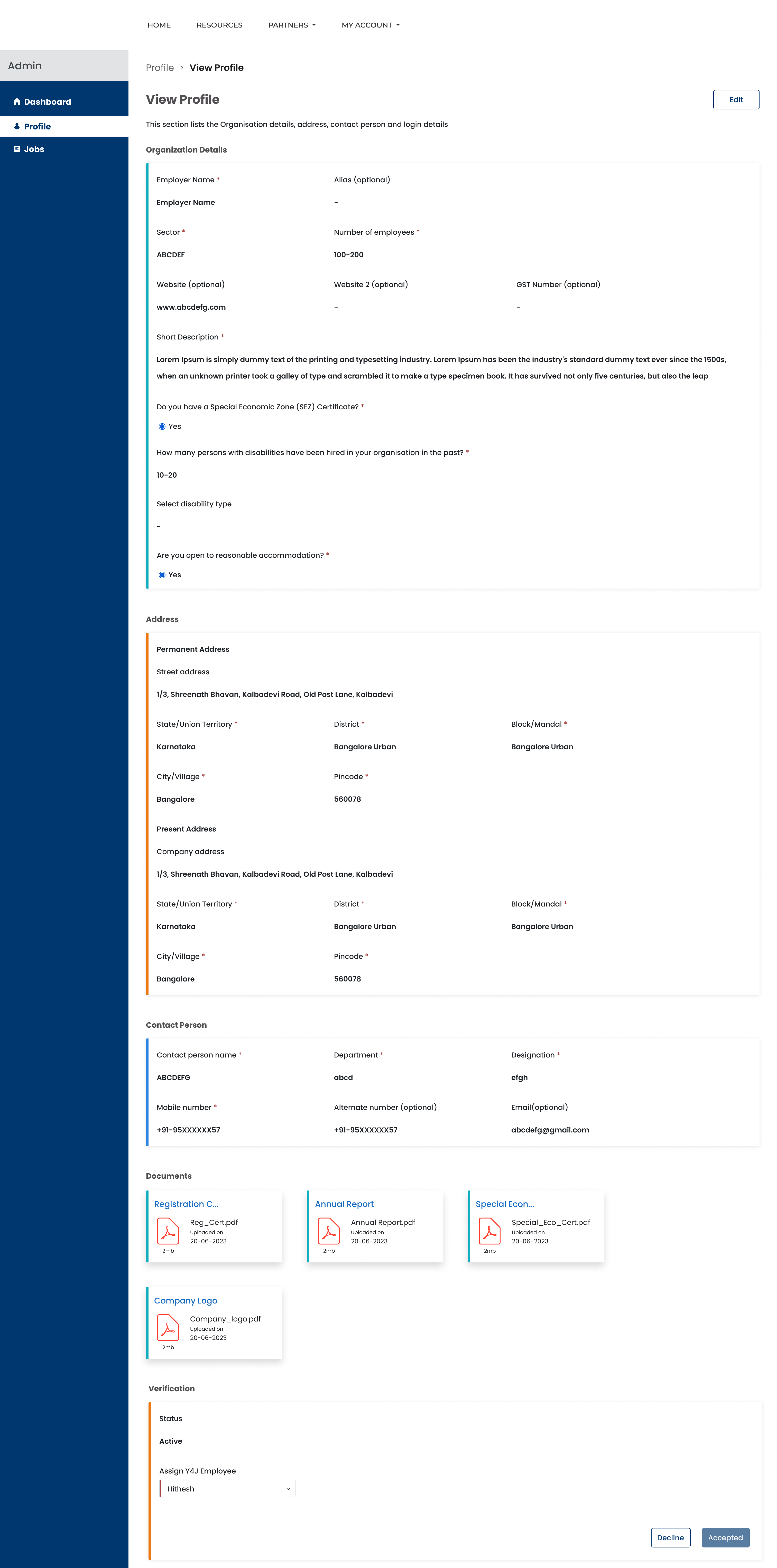
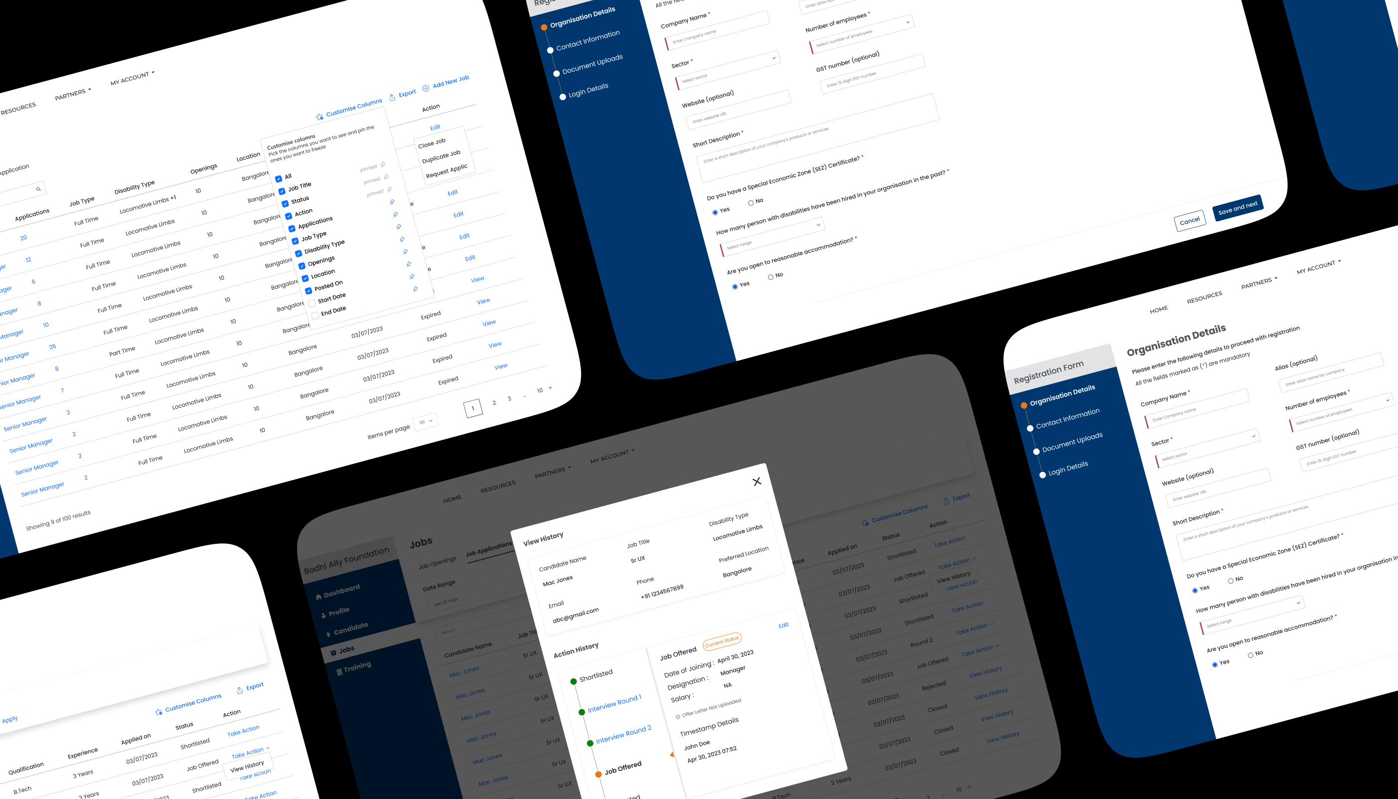
Created screens with forms, overlays, dropdowns, and other interactive elements. My focus was on making the process clear, easy to understand and navigate, and intuitive, while ensuring the design stayed consistent and user-friendly.


Built screens that guided users through submitting their applications. This included creating forms, validation messages, progress indicators, and confirmation steps. My goal was to make the process straightforward and easy to follow, ensuring a smooth experience from start to finish while keeping the design intuitive and consistent.


Created screens to guide employers through signing up and setting up their profiles. This included designing forms for entering company details, adding job listings, and setting preferences. I focused on making the process quick and easy to follow, with clear instructions and simple navigation to ensure a smooth experience from start to finish.


I designed the Employer Profile Management workflow, creating screens that allowed employers to easily update their company details, manage job listings, and adjust preferences. This involved designing simple forms and clear navigation for adding, editing, and removing information. My focus was on making it easy for employers to maintain an up-to-date profile with minimal effort.
The Outcome
01. 226,984 Registered Candidates Across 18 Disabilities
02. 116, 954 Total Job Vacancies Listed
03. Over 1200 Inclusive Employers Registered
So who noticed?
01. Nasscom Foundation’s TechForGood Award 2024
Awarded the Nasscom Foundation’s TechForGood Award 2024 in the category “AI for Social Good” under the segment “Segment B Not-For-Profit.
02. D4GX India Empowerment Challenge 2024
Awarded the 2024 D4GX India Empowerment Challenge in the category “Data to enable Learning & Livelihood”.
03. The Economics Times - Entrepreneur - Summit & Awards 2024
Awarded the 'Best Service Provider of the Year in Web & Mobile App Development’ (Jury Recommendation) by The Economics Times - Entrepreneur - Summit & Awards 2024.
04. 8th eNortheast Award 2023
Awarded the 8th eNortheast Award, 2023 for Best Digital Innovation in the category of Livelihood & Enterprise Development.
So what did I learn?
01. Collaboration Makes Designs Stronger
Regular design reviews and discussions with developers, stakeholders, and users helped refine ideas, catch issues early, and ensure the final product worked well for everyone. I particularly enjoyed collaborative design sessions with the senior designers.
02. Empathy Translates into Better User Experiences
Designing for people with disabilities required putting myself in their shoes and considering how they navigate digital spaces and making thoughtful choices that improve usability.
03. Iteration Is Key to Getting It Right
Testing, gathering feedback, and making continuous improvements helped refine designs and create a more intuitive experience. Every round of feedback brought valuable insights.
04. Balancing Aesthetics and Functionality
Ensuring the platform was visually appealing while staying highly functional and accessible was a challenge. Simplicity, clarity, and consistency helped strike the right balance.
05. Small Details Make a Big Difference
From button placements to color contrast, seemingly minor design choices had a huge impact on usability. Paying attention to these details made the platform more effective.
06. Accessibility Benefits Everyone
Ensuring the platform was visually appealing while staying highly functional and accessible was a challenge. Simplicity, clarity, and consistency helped strike the right balance.